About Me
Hi! My name is Aigerim, and I am a student at Middlesex University Dubai, studying Advertising, PR, and Branding.
My journey began in the restaurant industry, where I gained valuable communication and multitasking skills. Later, I explored digital marketing, working as an SMM assistant at a real estate agency. These experiences shaped my ability for creative thinking, analysis, and visual storytelling.
Currently, I am developing my skills in infographics and branding, striving to create visual identities that not only attract attention but also convey the essence of a brand.
Personality traits
5 core values
personality and values
Сritical thinking
Multitasking
Flexibility
Diligence and Perseverance
Creative
Multitasking
Flexibility
Diligence and Perseverance
Creative
Effectiveness
Respect
Trustworthiness
Growth
Spirituality
Respect
Trustworthiness
Growth
Spirituality

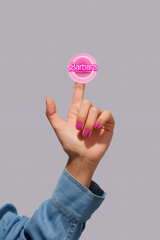
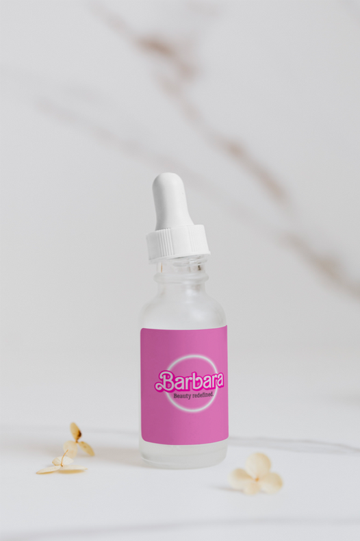
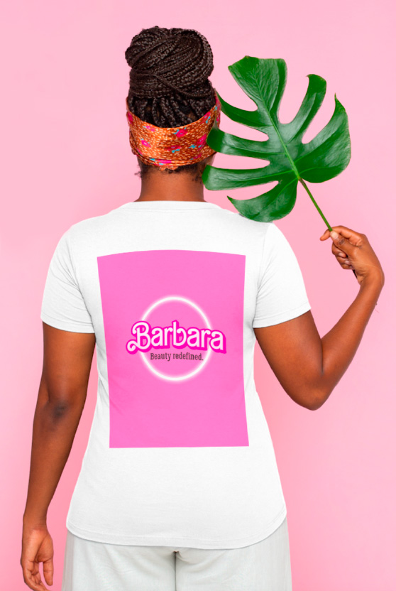
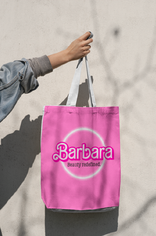
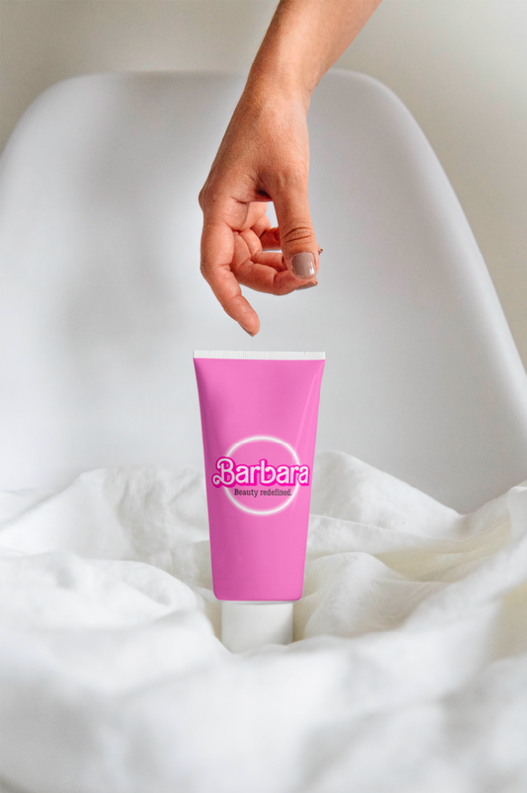
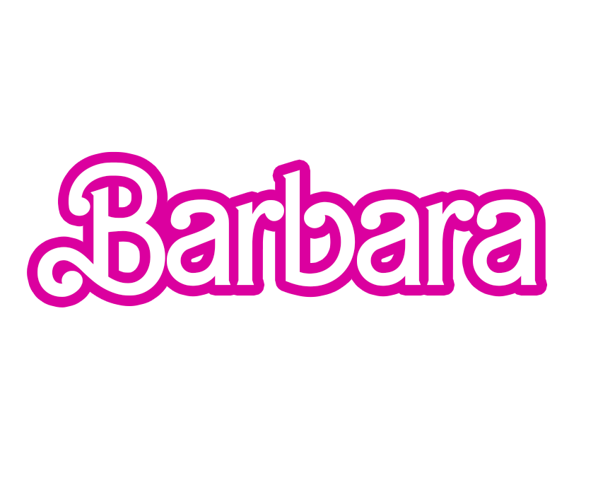
I have developed the Barbara Beauty Salon brand, inspired by the elegant aesthetics of the movie "Barbie". This project rethinks the standards of the beauty and lifestyle industry, focusing on the needs of modern women — multitasking moms and ambitious businesswomen. The salon is not just a place of self-care, but also a cozy space where they respect your time and strive to give you a sense of comfort and confidence.
Barbara Beauty Salon aims to break down established stereotypes about female beauty and the role of women in society, starting with the brand name and ending with every element of communication. In the photos, you can see how I designed the merchandising and packaging of the brand's products.
Barbara Beauty Salon aims to break down established stereotypes about female beauty and the role of women in society, starting with the brand name and ending with every element of communication. In the photos, you can see how I designed the merchandising and packaging of the brand's products.
Branding & Design
Barbara Beauty Salon

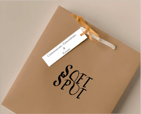
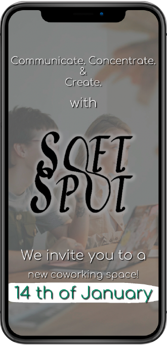
In the presented photos, you can see the elements of the corporate identity of the Soft Spot brand. Soft Spot is a coworking space with a cozy coffee shop, designed to provide people with a comfortable, inspiring atmosphere for work and leisure. The brand's concept is based around the idea of a "soft space" — a place where work does not pressure, but supports, where not only tasks are important, but also the human condition.
Soft Spot
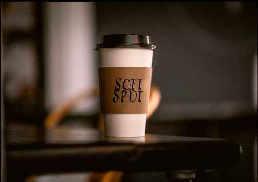
The first photo shows a branded glass for drinks from a coffee shop. The logo with smooth, soft typography conveys the main idea of the brand — to create a cozy and comfortable space for work. A warm, neutral palette enhances the feeling of calm and focus, which is especially important for a productive atmosphere.
The second image shows the packaging — a neat craft envelope with the Soft Spot logo. The minimalist design and natural materials emphasize the brand's values of simplicity, functionality and attention to detail. These elements form a holistic visual style that makes the brand recognizable and trustworthy.
The second image shows the packaging — a neat craft envelope with the Soft Spot logo. The minimalist design and natural materials emphasize the brand's values of simplicity, functionality and attention to detail. These elements form a holistic visual style that makes the brand recognizable and trustworthy.

Logos & Identity
Here are a number of logos designed by me as part of university projects. During the creation process, I drew inspiration from the aesthetics of famous brands, experimenting with their visual elements and adapting them to new ideas. For example, the SoftSpot logo includes a stylized letter "O", referring to the shape of the chair, thereby emphasizing the connection with comfort and coziness. My visual style tends towards minimalism and elegance, combining the conciseness of forms with the expressiveness of the concept.
Advertising Campaigns
As part of a series of mini-interviews, the stars will ask children simple but profound questions related to emotions, self-perception and life values. These conversations will show how sincere, open and free a child's thinking can be — in contrast to the often restrained and rational adult.
The aim of the project is to remind the audience that the inner child is not a weakness, but a source of sincerity, creativity and spiritual strength. Being an adult doesn't mean hiding your feelings or giving up on openness. We want to inspire people to have an honest conversation with themselves and others.
Part of the funds raised under the project will be directed to charity, which supports programs of psychological assistance and treatment of children in orphanages.
Part of the funds raised under the project will be directed to charity, which supports programs of psychological assistance and treatment of children in orphanages.
Walkers advertising campaing concept:
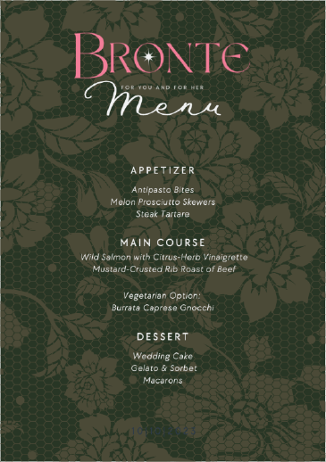
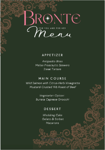
In this project, I designed the menu for the Bronte restaurant, striving for harmony between visual aesthetics and convenience of perception. The design is inspired by the elegant and romantic atmosphere of the establishment — the dark background with floral ornaments creates a sense of comfort and sophistication.
I paid special attention to the typography and structure: the menu is easy to read, and the design emphasizes the character of the brand and raises the level of visual perception of the restaurant.
I paid special attention to the typography and structure: the menu is easy to read, and the design emphasizes the character of the brand and raises the level of visual perception of the restaurant.
Design & Creativity
Bronte Restaurant Menu
Visual materials convey the key message of the brand through a concise presentation: the slogan “Communicate, Concentrate and Create with SoftSpot” emphasizes the concept of a space combining comfort, productivity and inspiration.
Advertising layouts for Instagram and YouTube of the Soft Spot brand
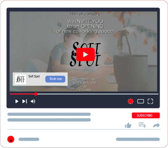
The design is minimalistic and consistent with the brand's corporate style: neutral tones, clean typography and clear structure make the visuals understandable and memorable.
The purpose of these promotional materials was to arouse interest in the new coworking space and convey the atmosphere of comfort and professionalism inherent in the Soft Spot.
The purpose of these promotional materials was to arouse interest in the new coworking space and convey the atmosphere of comfort and professionalism inherent in the Soft Spot.
Creative Concepts
Infographics & Presentations
SMM & Content
Branding & Identity
let`s work
together!
With a deep interest in infographics and creating other visual details for a brand that creates its identity, I strive to convey the entire image and purpose of the brand to its target audience.
I also have the goal of attracting new clients and increasing profits with the help of my skills such as critical, and creative thinking, flexibility, and the ability to creatively solve any problems.
I also have the goal of attracting new clients and increasing profits with the help of my skills such as critical, and creative thinking, flexibility, and the ability to creatively solve any problems.
CV
About me
As a driven university student eager to explore opportunities in Advertising, PR, and Branding. I bring a fresh perspective and a strong willingness to learn. While going up the career ladder, I've honed valuable skills such as critical thinking, creative problem-solving, social media management, and teamwork. With my desire for growth, I am enthusiastic to embrace my creativity in different fields.
Education
Bachelor of Advertising, PR and Branding Middlesex University
Sep, 2022- Apr, 2025
Foundation Certificate- Art, Design and Media Nottingham Trent International College Sep, 2021- Apr, 2022
SMM course Certificate 202
Beginner Photography Certificate
Sep, 2022- Apr, 2025
Foundation Certificate- Art, Design and Media Nottingham Trent International College Sep, 2021- Apr, 2022
SMM course Certificate 202
Beginner Photography Certificate
Contact
0523403151
a1gerim.kaisar2003@mail.ru Dubai, United Arab Emirates
a1gerim.kaisar2003@mail.ru Dubai, United Arab Emirates
Nationality
Kazakh
Links
Work Experience
Waiterinarestaurant- June-Aug,2022
-Сommunication with clients
- Sell main items and less popular menu items
-Maintain the atmosphere and cleanliness of the restaurant -Collaborating with colleagues-teamworking
Barista - June-Aug, 2023
-Making coffee beverages and other bar menu items according to customer preferences and standard recipes.
-Operating coffee equipment
-Providing customer service.
-Maintaining cleanliness: Baristas keep the coffee bar area clean and organized. -Managing inventory: monitoring inventory levels of coffee beans, milk, syrups, and other supplies, restocking items.
-Collaborating with colleagues- teamworking
Social Media Marketing Assistant - Feb- March, 2024
-Communication with colleagues -Engage potential clients
-Promote the company's services -Email Marketing
-Social Media Marketing
Skills
Social Media Management Communication Creative Problem Solving Photography
Creative Brainstorming Adobe illustrator
Canva
Infographics Multitasking
Сritical thinking
Creative Brainstorming Adobe illustrator
Canva
Infographics Multitasking
Сritical thinking
Hobbies
Dancing
Traveling
Psychology
Horse riding
Ceramics
Traveling
Psychology
Horse riding
Ceramics
Languages
English B2
Kazakh B2
Russian C1
Kazakh B2
Russian C1
research and development
Creating my online portfolio has become an opportunity to express my personality, professional ambitions, and cultural identity. The main goal was to create a visually cohesive and strategically thought-out website that would reflect my personal brand and could interest potential employers or creative partners.
Before starting to design, I conducted extensive research: I studied the portfolio websites of other specialists, analyzed modern visual trends, infographics, UX solutions, popular animations and ways of presenting content. Initially, I wanted to make the site lively and dynamic. I have compiled a selection of links to websites that inspired me and helped define the visual direction of my project.
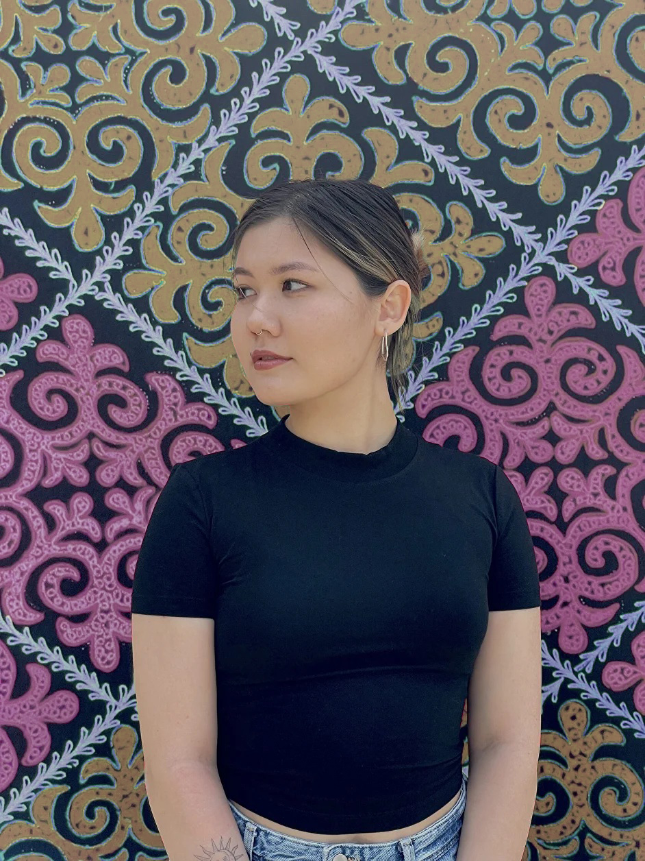
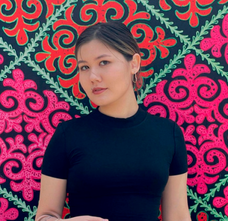
One of the key sources of inspiration was the Kazakh ornaments in my photo for the website, their color palette is shades of yellow and pink. I used these colors as accent elements on the site, emphasizing important details.
Since color adds emotional coloring and affects the perception of information, for example, the delicate pink color used on the site under the code #F6A6FF causes a feeling of comfort and tranquility. At the same time, in Chinese culture, this color indicates a bold manifestation of oneself in this world.
As for the light yellow color #F1CF9C, in psychology, this color speaks of calmness, ease in relationships with people, and intelligence. In culture, yellow can be associated with warmth, prosperity, hope and optimism.
The background color of the blocks is made in black and white. This combination has always been used to denote unity, forming complete harmony. Black symbolizes control, fortitude, and the ability to overcome difficulties. White – symbolizes enlightenment, inner peace and clarity of mind.
The structure of my website consists of four main sections:
1. About me
2. University Work Portfolio
3. Let's Work Together
4. Resume (CV)
I made a conscious decision to place the navigation vertically, to the left of the screen. This is not typical but visually interesting solution allows the site to stand out and make it memorable and unique.
I started my work by creating content for the About Me section. My personal photo is posted here against the background of Kazakh ornaments, the ones that inspired the choice of the website's color scheme. In the text part, I talked about my personal qualities, values and views that determine my attitude to work and the creative process.
Next, I moved on to creating a Portfolio of academic papers, in which I identified four areas::
• Branding & Design
• Logos & Identity
• Advertising Campaigns
• Design & Creativity
Each subsection contains specific work carried out within the framework of university projects, with brief descriptions of the concept and objectives.
I originally conceived the Let's Work Together section as a call to action. I wanted this block not only to inform about my services, but to invite me to work together. Initially, I considered the name Let's Do Something Together, but then I settled on a more professional and clear version — Let's Work Together. In this part, I briefly described the stages of working on projects and listed the services that I can offer. I also added an interactive element. When you hover the cursor over the images, it shows exactly which tasks are being performed at each stage of the work.
The final section was the CV, which contains my application form with the ability to download the full version of my resume. This makes the site convenient for potential employers and allows them to quickly access key information.
In general, when creating the website, I sought a balance between professionalism, visual appeal and personal style. My online portfolio is a reflection of my experience, aesthetic outlook and willingness for new professional experiences.
I have developed my website on the Tilda platform, which offers convenient tools for creating web resources. Working with this website builder is very exciting, and all the functions and tools are intuitive, which makes it easy to implement your ideas. My website is a landing page – a single-page website with the placement of individual page elements, menu, cover, gallery, form, text. I took Zero Block as a basis, in which I encountered some difficulties in terms of setting up animations, layering, and fitting text in a single style. Zero Block is the creation of unique blocks from scratch to implement non–standard tasks. This is an editor with complete freedom to customize the elements. The design is set up through the panel, where colors, fonts, margins and animations change, as well as formatting and uploading media files. Also, an anchor link was prescribed for each section, with their help, the content is easily divided into logical blocks, clicking on which a person will immediately go to the necessary information. My website is adapted for mobile devices, but for the perfect display, additional settings were required, such as scaling, adjusting the size of elements, rebuilding blocks, adapting the navigation menu, changing the font size, which also took time to study and test on real smartphones.
Thanks to this designer, I learned how to create a website from scratch, using various animations, choosing a color palette with the study of color philosophy, as well as a very important component - writing understandable and interesting text for the guests of my site.
References
Eygerardo, n.d. Eygerardo. Available at: https://www.eygerardo.com [Accessed 1 April 2025]
Nwabueze, O., n.d. Onyekachi Nwabueze Portfolio. Available at: https://www.onyekachi-mn.com [Accessed 1 April 2025]
Ngan, I., n.d. Isabel Ngan. Available at: https://www.isabelngan.com [Accessed 1 April 2025]
Vicentina, C., n.d. Cydney Vicentina. Available at: https://www.cydneyvicentina.com [Accessed 1 April 2025]
Tilda Publishing, 2022. How To Create Websites On Tilda. Getting Started. Available at: https://www.youtube.com/watch?v=M8GaXO8rO1s [Accessed 1 April 2025]
Tilda, n.d. How Tilda Works. Available at: https://help.tilda.cc/getstarted [Accessed 1 April 2025]
Tilda Publishing, n.d. Tilda Video Tutorials. Available at: https://www.youtube.com/playlist?list=PLWj7z0vo5SJWDYF17n6qsa5Tzd7HdoKhc [Accessed 1 April 2025]
Obukhov, N., n.d. How To Make a Website. Step-by-Step Guide. Tilda Education. Available at: https://tilda.education/en/how-to-build-website [Accessed 1 April 2025]
Before starting to design, I conducted extensive research: I studied the portfolio websites of other specialists, analyzed modern visual trends, infographics, UX solutions, popular animations and ways of presenting content. Initially, I wanted to make the site lively and dynamic. I have compiled a selection of links to websites that inspired me and helped define the visual direction of my project.
One of the key sources of inspiration was the Kazakh ornaments in my photo for the website, their color palette is shades of yellow and pink. I used these colors as accent elements on the site, emphasizing important details.
Since color adds emotional coloring and affects the perception of information, for example, the delicate pink color used on the site under the code #F6A6FF causes a feeling of comfort and tranquility. At the same time, in Chinese culture, this color indicates a bold manifestation of oneself in this world.
As for the light yellow color #F1CF9C, in psychology, this color speaks of calmness, ease in relationships with people, and intelligence. In culture, yellow can be associated with warmth, prosperity, hope and optimism.
The background color of the blocks is made in black and white. This combination has always been used to denote unity, forming complete harmony. Black symbolizes control, fortitude, and the ability to overcome difficulties. White – symbolizes enlightenment, inner peace and clarity of mind.
The structure of my website consists of four main sections:
1. About me
2. University Work Portfolio
3. Let's Work Together
4. Resume (CV)
I made a conscious decision to place the navigation vertically, to the left of the screen. This is not typical but visually interesting solution allows the site to stand out and make it memorable and unique.
I started my work by creating content for the About Me section. My personal photo is posted here against the background of Kazakh ornaments, the ones that inspired the choice of the website's color scheme. In the text part, I talked about my personal qualities, values and views that determine my attitude to work and the creative process.
Next, I moved on to creating a Portfolio of academic papers, in which I identified four areas::
• Branding & Design
• Logos & Identity
• Advertising Campaigns
• Design & Creativity
Each subsection contains specific work carried out within the framework of university projects, with brief descriptions of the concept and objectives.
I originally conceived the Let's Work Together section as a call to action. I wanted this block not only to inform about my services, but to invite me to work together. Initially, I considered the name Let's Do Something Together, but then I settled on a more professional and clear version — Let's Work Together. In this part, I briefly described the stages of working on projects and listed the services that I can offer. I also added an interactive element. When you hover the cursor over the images, it shows exactly which tasks are being performed at each stage of the work.
The final section was the CV, which contains my application form with the ability to download the full version of my resume. This makes the site convenient for potential employers and allows them to quickly access key information.
In general, when creating the website, I sought a balance between professionalism, visual appeal and personal style. My online portfolio is a reflection of my experience, aesthetic outlook and willingness for new professional experiences.
I have developed my website on the Tilda platform, which offers convenient tools for creating web resources. Working with this website builder is very exciting, and all the functions and tools are intuitive, which makes it easy to implement your ideas. My website is a landing page – a single-page website with the placement of individual page elements, menu, cover, gallery, form, text. I took Zero Block as a basis, in which I encountered some difficulties in terms of setting up animations, layering, and fitting text in a single style. Zero Block is the creation of unique blocks from scratch to implement non–standard tasks. This is an editor with complete freedom to customize the elements. The design is set up through the panel, where colors, fonts, margins and animations change, as well as formatting and uploading media files. Also, an anchor link was prescribed for each section, with their help, the content is easily divided into logical blocks, clicking on which a person will immediately go to the necessary information. My website is adapted for mobile devices, but for the perfect display, additional settings were required, such as scaling, adjusting the size of elements, rebuilding blocks, adapting the navigation menu, changing the font size, which also took time to study and test on real smartphones.
Thanks to this designer, I learned how to create a website from scratch, using various animations, choosing a color palette with the study of color philosophy, as well as a very important component - writing understandable and interesting text for the guests of my site.
References
Eygerardo, n.d. Eygerardo. Available at: https://www.eygerardo.com [Accessed 1 April 2025]
Nwabueze, O., n.d. Onyekachi Nwabueze Portfolio. Available at: https://www.onyekachi-mn.com [Accessed 1 April 2025]
Ngan, I., n.d. Isabel Ngan. Available at: https://www.isabelngan.com [Accessed 1 April 2025]
Vicentina, C., n.d. Cydney Vicentina. Available at: https://www.cydneyvicentina.com [Accessed 1 April 2025]
Tilda Publishing, 2022. How To Create Websites On Tilda. Getting Started. Available at: https://www.youtube.com/watch?v=M8GaXO8rO1s [Accessed 1 April 2025]
Tilda, n.d. How Tilda Works. Available at: https://help.tilda.cc/getstarted [Accessed 1 April 2025]
Tilda Publishing, n.d. Tilda Video Tutorials. Available at: https://www.youtube.com/playlist?list=PLWj7z0vo5SJWDYF17n6qsa5Tzd7HdoKhc [Accessed 1 April 2025]
Obukhov, N., n.d. How To Make a Website. Step-by-Step Guide. Tilda Education. Available at: https://tilda.education/en/how-to-build-website [Accessed 1 April 2025]
Dubai, UAE
